Friday, 13 March 2009

Question 6


What have you learnt about technologies from the process of constructing the product?

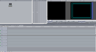
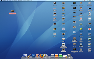
During the process of construction our media product, i have learnt about using a lot of technologies. First of all, i have learnt how to use an Apple Mac, as it is a lot different to a normal Windows computer. I have also learnt about Final Cut- the programme that was used to edit the video footage and put it together with sound and special effects to make the final project.
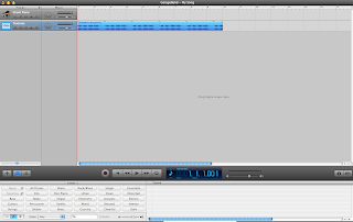
I also used Garageband to create the music that was used at the beginning and end of the opening sequence. To create the titles i used Photoshop and then saved them as a Jpeg so they could be easily inserted into Final Cut, where i could move them around and add fade effects to them.
I have learnt more about using the camera aswell, and know how to shhot a variety of shots.
Labels:

Question 5

How did you attract/address your audience?

To attract our audience we first showed the main character flailing in bed, telling the viewer that there is something wrong with him. We then started to skip between scenes of him flailing and a flashback of him in the army. We edited this well to give the opening a really fast pace, and added fast, intense music to add more effect.
We then zoomed into the characters' eye and used a special effect to create a swirling pattern.It then went to the full flashback of him in the war. We used different camera angles and used a point of view shot to make it seem like the viewer is in the characters' shoes and can experience the war. We used lots of good sound effects to make the war scene more realistic, such as gun and helicopter sounds.
The feedback from the class told us that they enjoyed the editing and special effects. They also said the different camera angles and the use of props and army costumes were good.

Labels:

Question 4.

Who would be the audience for your media product?

Our media product would probably have a 15 classification as it would have frequent use of strong language in the war scenes and some when the main character is stressed. The BBFC website classes the violence in a 15 movie as "Violence may be strong but may not dwell on the infliction of pain or injury", which our film would do as it would do, like the opening sequence, where the viewer sees a death early on, but the death is not dwelt on as the scene changes almost straight away.
The demographic of our audience would be that they are not easily shocked by scenes of war and death, and also bad language. We can tell the first two from the opening sequence as there is a war scene where somebody gets killed.

Labels:

Wednesday, 11 March 2009

FINAL VIDEO

Question 3

What kind of media institution might distribute your media product and why?

Our media product would probably be distributed by a small film company as it is a low budget film with not many effects. One company that might distribute our film is 'Mental Health Media'. This is a media company that specialise in getting across the message of mental health disorders. As our film is about post traumatic stress disorder (PTSD), we feel that this co
mpany may distribute our film to get across the message of PTSD.
Our Film opening has two logos at the start to empahsise the name of the company so that the
viewers remember it. This is because it is a small company and will need to make money for other films. Money would be made from DVD sales and downloads, as the film would probably not be released in the cinema as it is too small a movie.

Labels:

feedback for our Opening Sequence.

Strengths - good editing, good placing of titles, effective use of camera angles, good use of various props costumes and special effects, good mise-en-scene.

Improvements - our main area which people commented on was the fact that our font of our titles did not fit in with mise-en-scene. however us as a group feel that the titles are well placed and fit in with the storyline.

Target Audience - an older audience of around 15+, due to the battle scenes and war zone atmosphere. another audience we feel as a group we would appeal to are people who have been affected by PTSD (post traumatic stress disorder)

Labels:

Tuesday, 10 March 2009

Question 1

In what ways does your media product use, develop or challenge forms and conventions of real media products? Compare and contrast your own sequence and one which you think has generically influenced you.


Our film opening uses the convention of skipping quickly between different scenes when editing. We have included this convention at the start of the sequence where it skips between the main character waking up and flailing, and the flashbacks of him in the army.
When making our sequence we were influenced by th
e opening sequence of 'True Blood'. This sequence uses the editing technique we have used and also uses white titles against the background of the images. This is what we decided to use, as black titles would be too dark and coloured titles would diminish the seriousness of the sequence.


Labels:

Question 2


How does your media product represent particular social groups? On photoshop cut and paste a character from your opening sequence and one from a real opening sequence that you think has similar representational issues. Compare and contrast.

Our media product represents particular social groups through the use of character situations and costumes. for example in our opening sequence we have a man who is having flash backs of his past experience in the armed forces. Our main character is male, our reason for this is that it is a stereotypical way in which the armed forces relate to men unlike woman. To present our character we have used character costumes and props to introduce realism to our sequence. we have based our main character around a t
ypical soldier in the armed forces who has experienced the life in a war zone and has fought through the battle of dealing with a death of someone he knew and worked with. we hear about the deaths of our British soldiers all the time in the news however, most people don't realise the effect it has on the soldiers that witness the deaths of their colleagues.


Labels:

Monday, 2 March 2009

MONDAY 9th MARCH - 9am - EVALUATION DRAFT TO MOODLE


MONDAY 9th MARCH - 9am - EVALUATION DRAFT TO MOODLE

Evaluation Questions


The following questions must be answered in your evaluation PowerPoint:

1. In what ways does your media product use, develop or challenge forms and conventions of real media products?

2. How does your media product represent particular social groups?

3. What kind of media institution might distribute your media product and why?
4. Who would be the audience for your media product?

5. How did you attract/address your audience?

6. What have you learnt about technologies from the process of constructing the product?

7. Looking back to your preliminary task, what do you feel that you have learnt in the progression from it to the full product?

Labels:

Friday, 27 February 2009

ROUGHCUT

Friday, 30 January 2009

P1-06 FILM OPENING PROJECT ANIMATIC

Tuesday, 27 January 2009

Titles


These are the titles for our opening sequence. I chose the first font because it looks good and is not a standard boring font like Times New Roman. I also think they will work well in the first part where the character is sleeping and they come up on the bed.
We chose to have them white as they would show up better in the war scene against the bushes and trees. We may have a problem when we find a bed to film in as we may have to use a white bed, in which case we would have to change the title colour to black for those parts.
I chose to have a different font for the main title so it would stand out more as it is the most important one. It is also white as it will be against a plain black screen.

Labels: , ,

Friday, 23 January 2009

True Blood


We have chosen to analyse this film opening be cause we were influenced by the title sequence.

Camera Work
The camera work makes it seem as though you are watching it at the time in a first-person viewpoint.

Editing
The sequence is a continual, fast paced, rush of different events; all seen from a first-person view. Lots of transition is used to flash from one thing to another.

Sound

The sound is US Country music and is
non-diegetic.


Mise-En-Scene

At the start the camera is going through a swamp and then changes to a point of view (POV) of a someone driving a car. Next it is a POV shot of moving through a town; presumably in the same car. Suddenly what looks like a naked woman flashes up. Then the sequence keeps flicking form views of people in churches, a sleazy nightclub (with people dancing and having sex) and people who live in the area (like a man in a rocking chair).

There is also several bits of old film of riots and of a child who looks like he is with the Klu Klux Klan.


There are also various shots of dead animals and shots of other things like a rusty car in a forest.


Titles
The titles are in white and apear, almost at random, during the opening sequence. If they are more than two words the word font changes.

Labels: , ,

Mood Board

Mood Board P1 06
View more presentations or upload your own.

Wednesday, 21 January 2009

Cast List

Convict Productions
Mark Slim
William Model
Tom Steward
Costume Design by Jazeb Malik
Art Direction by Ben West
Production Design by Bruce Dild
Casting by Paul Doe
Film Editing by Travis Pitts
Cinematography by Nikolai Moltov
Original Music by Nelson Ambagado
Produced by Jason P. Dee
Directed by Albert Hunter

Labels: ,

Tuesday, 20 January 2009

Opening Sequence Idea

For our opening sequence we have decided to do a British social realist drama. We have decided to base it on the topic of Post Traumatic Stress disorder.
The sequence starts with a man asleep. The camera then zooms into his eye and he suddenly wakes up in a panic. It then zooms fast into his eye as they open. After a black screen it will go to a flashback of the man in camouflage in a war. He runs and jumps into a ditch as he is being shot at.
We then see his best friend get blown up with a grenade, which is the cause for his PTSD. Lastly, it goes back to him sitting up awake and panicking. It then zooms out and shows the title: Sleepless Night.

Labels: , ,

Friday, 16 January 2009


This is our second idea for a film logo. we have tried to keep this one as simple as possible by using only fades for the logo with an added sound clip of thunder. we have done this as it keeps the photo more eye catching and keeps the audiences attention on the actual design.

to create this short clip, we used photo shop for the design of the logo and final cut and garage band for the editing process.

because we like both logo clips we have decided to show both of them in our film opening sequence one at the beginning and one at the end :)

Labels: ,

Wednesday, 14 January 2009

Product Logo animation


This is one of our final production company logos, after animation was added in Final Cut. We decided not to make it too long and to keep it simple, which is why it is only 3 seconds long and has minimal animation. The first thing we did was add motions to make the two words move up and down the screen at the same time. We wanted this to be quick as to not bore the viewer.
Next, we added a quick fade for the handcuff image. We then shortened all of the layers and then added the sound. We downloaded a sound clip of a door slamming from the internet. This is to be the prison cell door slamming closed, which goes with the name 'Convict Production'.

Labels: , ,

Logo idea 2


This is our second idea for our company logo. as already explained below, we have called ourselves 'Convict Productions'. With this idea we have tryed to create a investigation type of atmophere for a murder or assult etc. to create this we found a photo of a magnifying glass in which we used photoshop to insert the blood and fingerprint. with the text we downloaded a font of a website and created the look as if the text is being enlarged by the glass by increasing the font size.
we feel this logo is effective and we will consider using this if not the other idea as our main logo.

Labels: , ,

Tuesday, 13 January 2009

Production logo idea 1


This is one of our two initial ideas for the production logo. We decided on the name 'Convict productions' because Alex was looking for words in the student planner and we decided to use convict. As it is called convict productions we decided to use a pair of handcuffs as the main image. The handcuffs had a white background so we had to make that black. We decided to keep the handcuffs black and give them a white outer glow to make them stand out. We also decided to make the two words different colours and have them connected to make it look better.

Labels: , ,

Friday, 28 November 2008

P1-06 FILM OPENING PROJECT


We have chosen to analyse this film because it is an iconic British film and it is written and directed by a British man- Guy Ritchie. We have chosen to do a British social drama for our project.

Camera Work
A lot of the sequence is of television screens with CCTV footage of the characters going into the building and up to the room. Once they are in the room and get their guns out the camera starts to move and is freehand.

Editing
Very fast pace once they get the guns out and steal the diamonds. it slows down when they are in the van but speeds up again after that. It freezes to show the names of each character and has a coloured background each time with the image played with. Transitions used as well.

Sound
Jewish music as the footage is shown of them in the building. In the van the music is light and builds up to the fast paced music afterwards. At the start when they are in the building you hear them talking.

Mise-En-Scene
They are dressed up as Jews at start with fake beards etc. The CCTV is black and white at this stage. It goes to full screen and colour when they get in the room. They have guns as props, and also the diamonds when they get them. After the title is shown the light is darker and the characters are introduced.

Titles
Some titles in black rectangles on the CCTV and screen when they are getting the diamonds. 'SNATCH' in white in front of diamond, which spins round 360 degrees. Characters' names are in white with different coloured backgrounds and an image of their face.

Conventions
  • The audience assumes all of the people working in the office are Jewish. The men are all involved in crime, as we see early on. They are given different roles such as the older one and the hard one.
  • The first location is in what is presumably a Jewish-run bank with a Jewish community, which the men are pretending to be involved in.
    The men are shown after that in a a warehouse and then a pub- showing they probably like drinking.
  • There is a cultural reference to the Jewish community, and they are also talking about the bible.
  • The genre is crime.